Amazon Changed Their App Logo Because It Looked Like Hitler’s Mustache
Amazon has quietly unveiled a new mobile logo just weeks after an initial logo update—and we don't blame them.
On Jan. 25, a new Amazon app logo was launched for iOS users in Britain, Spain, Italy and the Netherlands, replacing the old icon that was introduced five years earlier. Just a few weeks later, however, on Feb. 22 global iOS users received an even newer logo update, while Android owners saw theirs updated on March 1.
Amazon explained to BBC News that they trialed the new icon in select locations to test out its appearance before a full worldwide roll out.
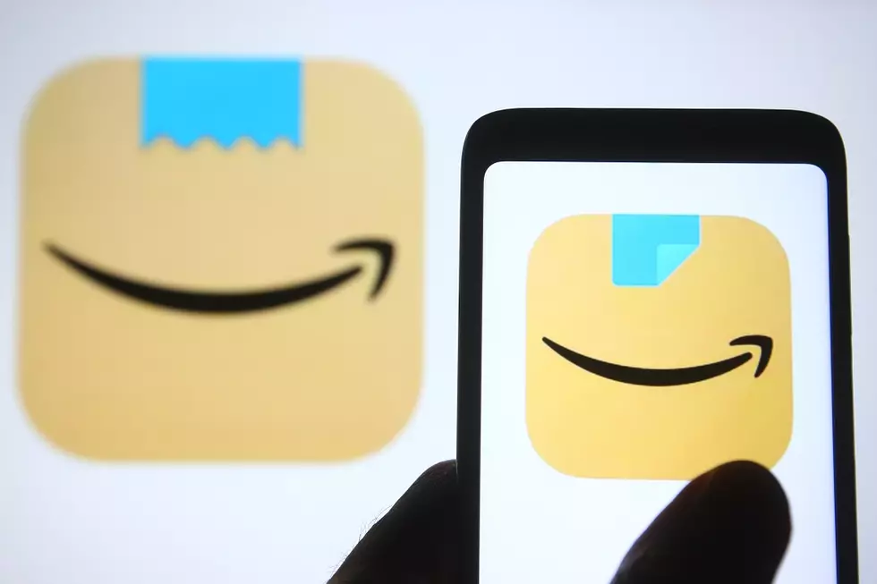
Unfortunately, many users noticed that the initial new logo, which included a brown paper box featuring the signature Amazon smile logo in the shape of an arrow with a jagged piece of a blue tape above it, somewhat resembled Adolf Hitler's mustache. Because of the smile's placement right below the tape, some customers compared it to the infamous facial hair.
Amazon quickly and quietly updated the new logo by replacing the "mustache-like" blue jagged tape design. The newly updated icon now features a squared off tape design, that is being peeled from one side—something people can't mistake for Hitler's mustache.
Prior to the early 2021 update, the app's icon was a shopping cart with the Amazon name and signature smile icon above it.
“Amazon is always exploring new ways to delight our customers,” Amazon said in a statement to the press. “We designed the new icon to spark anticipation, excitement, and joy when customers start their shopping journey on their phone, just as they do when they see our boxes on their door step.”
According to the New York Times, an email from the company states that the new icon "follows recent visual and functional updates."
Discontinued McDonald's Menu Items
More From Majic 93.3


